Hi guys, I’m using the Gauge widget on my dashboard and it looks great. However, some areas are hard to read because of the color palette I am using and the white background. Is there a way to make my visualization more readable?
Hi @Adam, could you provide more details, the specific area of the Gauge visual that needs to be more readable? A picture would be great.
Hi @arturo, of course, the issue I am having is with the tick values inside the Gauge, they are a little hard to read. See the picture below:
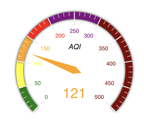
I see the problem. You can handle it using the scaleLabel option as follow:
.set(“scaleLabel”, { textBorderColor: ‘grey’, textBorderWidth: 2 })
The scaleLabel option receive an object with two keys: textBorderColor defines the border color and textBorderWidth defines the border width around the tick labels.
You can learn more details on how to configure the Gauge visual by looking into this document