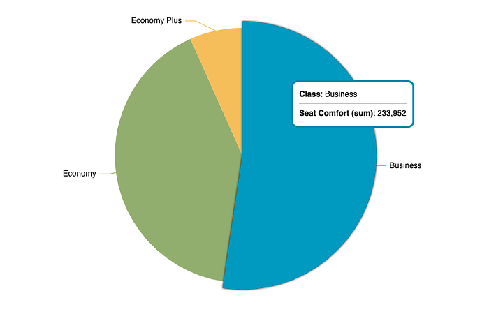
Hello community, I have a pie chart with which I am showing the score of the seats comfort in 3 types of classes on flights in general of the airlines according to data from surveys carried out. Now, using the ChartFactor Studio editor, I see that I can make some configurations to the chart, such as specifying colors by category or by metric value, colors by range, or even colors by a specific value.
This is what my pie chart looks like:
In this time I would like to make some more advanced customizations to the pie chart, such as font color, size, font, and so on.
I wonder if it is possible to achieve this and if so, how could I do it?
Hi @moshdev, I tell you that the pie chart as well as all of the Standard module are based on the Echarts library, which supports many customizations.
Only by using the property advancedOptions you can modify the options and get the desired styles. Take a look at our section dedicated to advanced options in the chartfactor documentation and you will see how to use them.
Additionally, I share with you a Chart Advance Options Demo in which you can interact with some of these properties and see how they work.
Hope that can help you, if you have any other questions don’t hesitate to ask.
Best regards
Hello @juan.dominguez, wonderful, that is exactly what I want to do. I’m going to dig a little deeper into this, and if I have any questions I’ll let you know.
