How to simulate the client filter effect on visualizations when hovered


#1

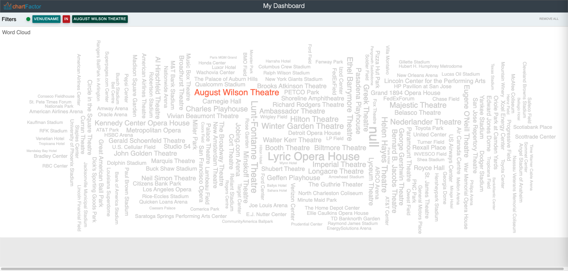
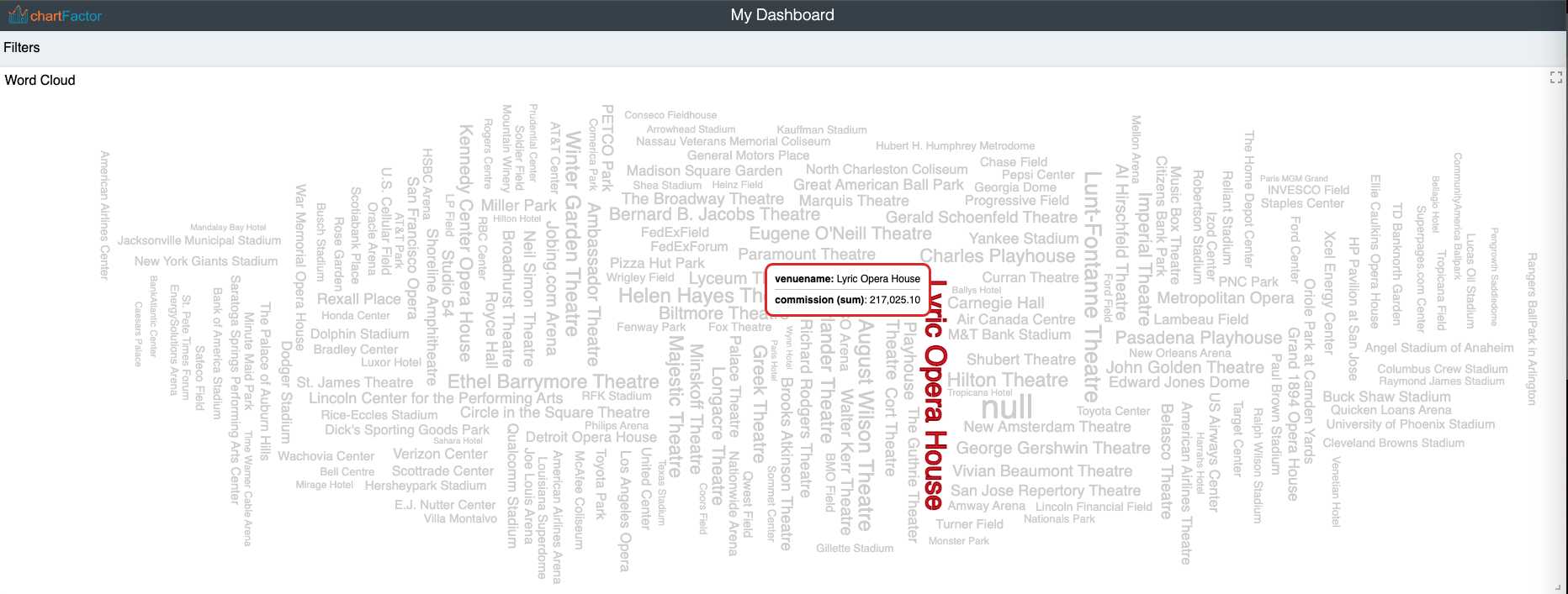
Hi community, I have Word Cloud visualization, with which I want to recreate the same effect that is generated when the client filter is configured and an element is selected, that is, the hovered element is colored but the others are colorless (grayed out).

I explain better with this image:

What is in the image above is exactly what I want to achieve but not when clicked, but when I hover an element of the graph.

Thanks in advance.


#2

Hi @eleana, thanks for reaching out. Yes indeed, it is possible to achieve that by subscribing to the mousemove and mouseleave events of the display, and then, by interacting with the updateWithClientFilter() function of the Aktive instance corresponding to the display.

The following piece of code does what you’re trying to do:

.on('mousemove', event => {
   const chart = cf.getVisualization(event.chart);
   chart.updateWithClientFilter({
      path: 'your_field_name',
      operation: 'IN',
      value: [event.data.group[0]]
   })
})
.on('mouseleave', (event) => { 
    const chart = cf.getVisualization(event.chart);
    chart.updateWithClientFilter()
})
.element("my_chart_id")
.execute()

Try adding that code to your visualization and let me know how it goes. :sunglasses:


#3

Hi @juan.dominguez, that’s outstanding, I tried it and I think it’s lovely. This is my final result with no filters applied: