Hi guys, I have a little styling problem with the timeslider widget, let me clarify it more:
I have a timslider widget that uses the full width of the parent element (div) and when I resize the screen… it adds a little margin to the right:
Are you sure you are using your CSS styles correctly ?, because it’s very likely because you are not using the full width of the screen in the parent element, so the child element will not use the full width either, maybe we need to see your html and its styles
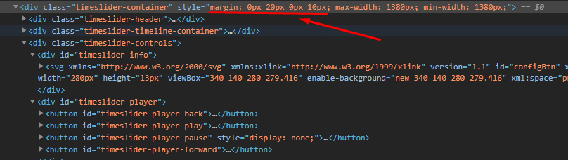
Yes, indeed, I think that the problem is with the widget, I was checking more thoroughly and I could see that inside the div it is generating other divs and an SVG, which is automatically changing its margin to the right.
Hi @mdemian, my suggestion is: you can use your stylesheets to overwrite the css classes you are seeing inside the widget, in that case don’t forget to use the “!Important” in your styles.
